Conscienza team is proud to host the 2nd edition of the festival at Hippodrome Tongeren on September 23, 2017. The event brings together artists and inspiring people from the world of upcycling, creative reuse, local production and artisanship to show us what they do to make this post-capitalist, climate-changed world a better place. We will be gradually publishing all of our 2017 participant profiles, so stay tuned!
When graphic designer Bart Dewolf was tasked with creating an image to represent “Conscienza”, he started with a story. That story is about conscious consumerism, recreating and recuperating, about thinking and about hope for the future — all things the Conscienza Festival tries to address.
The Evolution of the Conscienza Logo
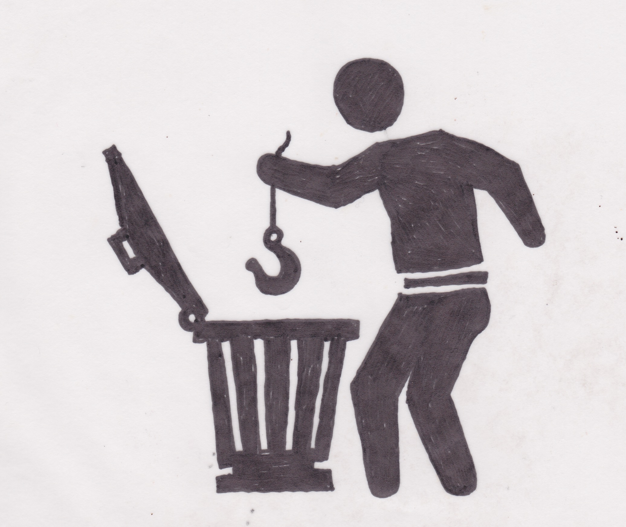
It was this combination of the tangible and intangible that inspired the design of the logo. The image features a hu-wo-man holding a crane hook above a garbage bin. Bart let us peek inside his process – from initial sketch to final product – and shared some tidbits about what inspired him.
“My first idea was to work around a person using a fishing rod, being disappointed with a nice big fish but walks away full of joy with the archetypical broken boot. First of all, this is sad for the fish, second it’s more a cartoon than a logo. Therefore, the fishing rod became an arm, as the boom of a crane, with the cable and hook instead of the fishing line,” he explains, referencing what would become the Conscienza logo.
“The Conscienza logo became a mockery in second degree on the famous icon for “please throw me in the garbage bin”. The original variation showed mostly an item that people disliked and wanted to present that as being ‘trash’. The version with the swastika thrown away as one of the more recognisable versions”.
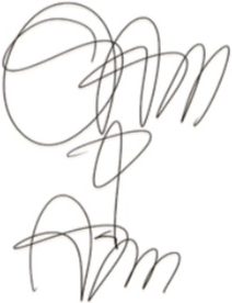
The First Sketch of the Conscienza Festival logo
As with all things, we’re left with the final logo and generally no indication that there was a brainstorming process to get to it. But, as with all things, there is a history.
“After sending the first sketches to Marina, she reacted not as I expected. She asked me why it had always to be a man in those generic logo’s?”, remembers Bart. “I, myself, was not thinking in themes of gender, rather as a depiction of a huMAN being (instead of a carrot, a cow or a violin). And that only proved Marina was right. We talk, in general, about MANkind, huMAN beings. Seems that English, as most Western languages, comes out of patriarchic organized society. Which we sometimes take a bit too much for granted. Hence, I decided to make a version depicting a ‘huWOMAN being’. For WOMANkind so to speak. “Which, I found out later, didn’t insult (as definitly not was meant to be, but I got afraid after sending the version, my intention might have been misunderstood) but caused a good and serious laughter at the Conscienza headquarters (speak out as, “Anushka’s and Marina’s kitchen”)”.
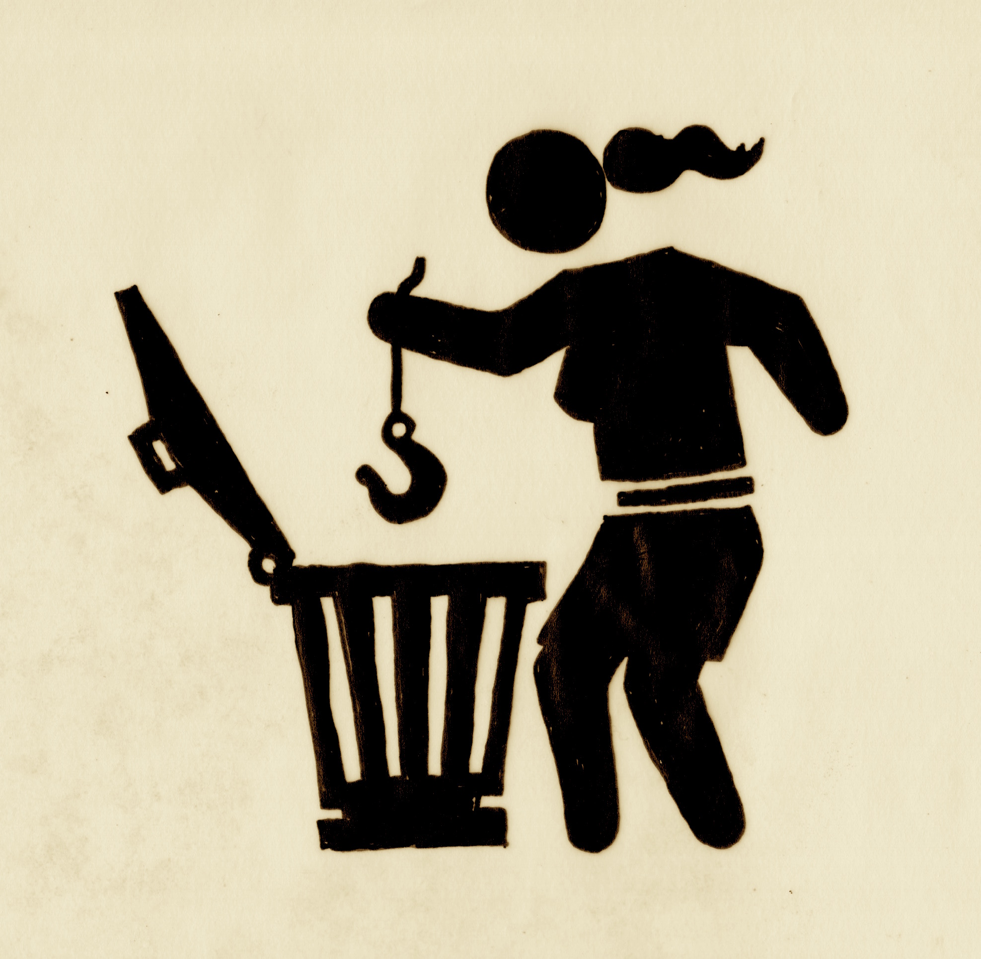
The Second sketch of the Conscienza Festival logo
“At the end, to avoid the touchy feelings of mankind, we decided to develop a unisex version. A uni-version”, says Bart.
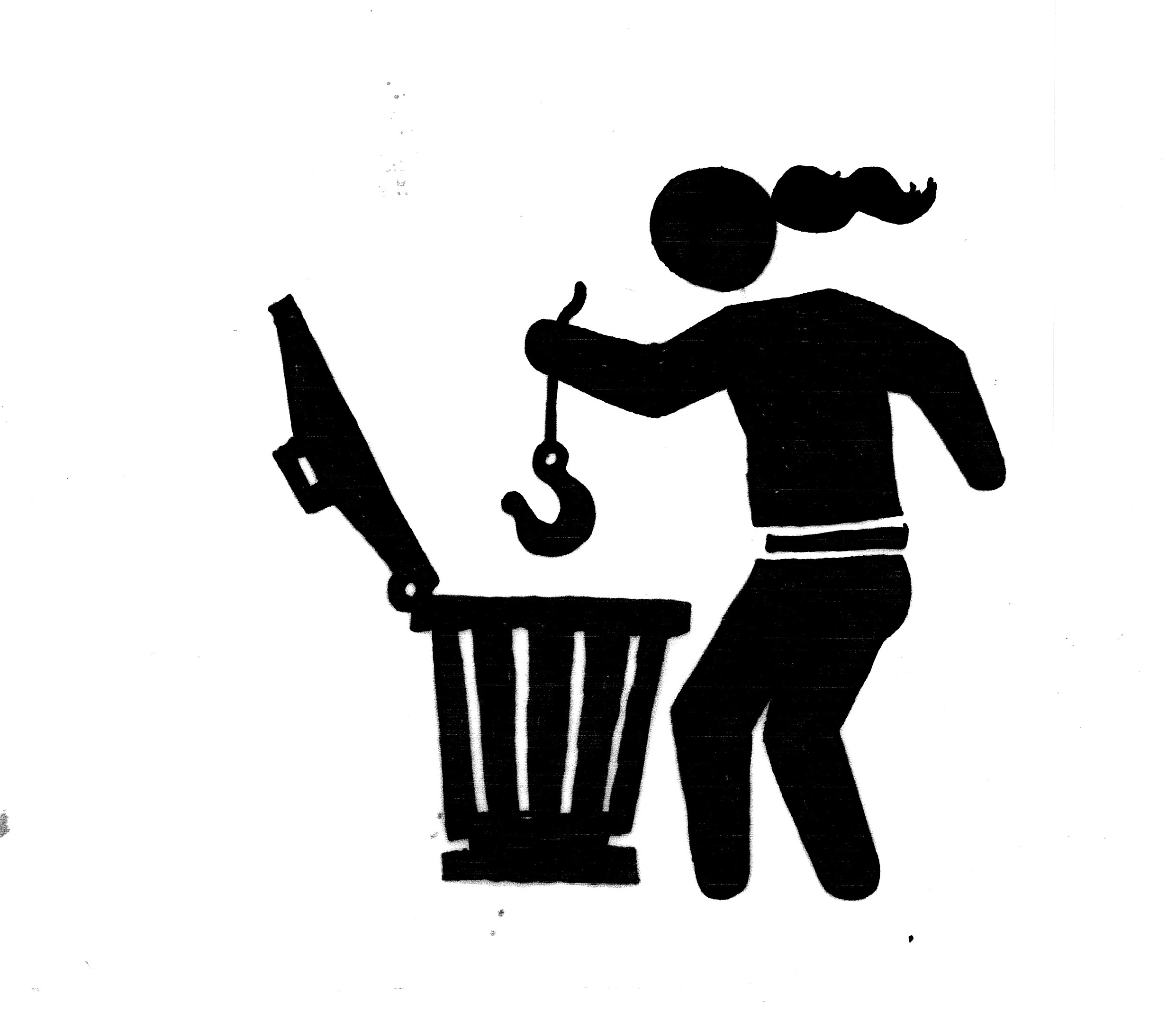
The Final Variant of the Conscienza Festival logo
Dewolf’s Design Technique
“The technique used for this graphical version is a technic I developed when trying to find a very straightforward, cheap and monkey proof way of printing with basic machinery. It’s kind of inspired by silkscreen printing but I’d rather call it ‘mosquito screen printing’. I do not think I need to explain further what is used as screen.
The advantage of this is that it’s cheap, easy to find, strong and reusable. I’ve used it to provide black and white copied posters for events from a colour touch (and because of the thickness of the print almost as a bas-relief), we’ve printed T-shirts with this technique and even printed our logo straight on the bottle from a friend winemaker that offered us an amount of wine for a vernissage”.
“I remember that I cleaned out the screens when printing during a vernissage, with a hardcore band playing next to me, by first having to break the ice on the barrel with rain water, collected for flushing the toilet. Nobody seemed interested in learning the technique (it was set up as a workshop), but the t-shirts were sold out in no time. Almost as quick as the wine!
In general, it’s not more than a cut out paper stencil, where the mosquito screen functions as grid to keep all the pieces on the same place. Due to the big chance of misprints, it’s an interesting technique to use when the end result can be a bit more expressive, and when there is time and place for layers of try outs and series of prints”.
Dewolf’s complete collection of rare Conscienza logo prints will be displayed at the 2017 Conscienza festival. Don’t miss it!
By Marina Kazakova